Introduction
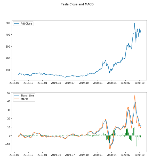
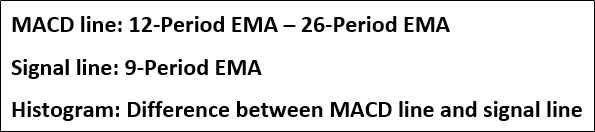
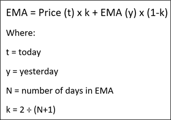
The purpose of this project was to create datasets followed by graphs of moving average convergence divergence (MACD) and 9-day exponential moving average (EMA) of the MACD to make better investment decisions. The 9-day EMA is referred to as the signal line as shown in the image below. The formula for calculating EMA can bee seen in the image below as well. MACD and the signal line are often represented as a histogram as well. This histogram is the difference between MACD and the signal line.
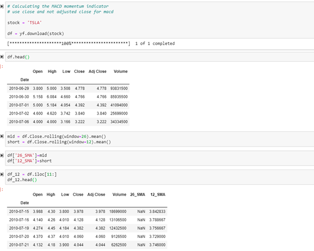
The resources I used to perform this project were Pandas, matplotlib, and yfinance as shown in the imports below.

I began by importing all of the data for Tesla’s stock. Once this was complete, I calculated the simple moving averages for 26 day and 12 day. This was done because the first iteration of calculating EMA needs to use SMA. The first 12 rows were sliced off so that column 12_SMA did not have any NaN values.
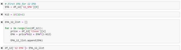
The 12-day EMA was then calculated using the code below. This list of the 12-day EMA was added onto the data frame.
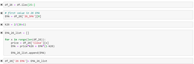
The exact same process was done for the 26-day EMA as shown in the code below.
The data in dataframe df_12 was then sliced (to match the length of df_26) and then attached on to the dataframe and renamed back to df. After this was done, the MACD for each data point was calculated and also added on to dataframe df.


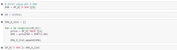
With the MACD being successfully calculated, it was then used to create a 9-day EMA of the MACD itself as shown in the code below. This 9-day EMA of the MACD being the signal line.

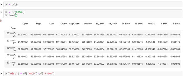
The data frame was sliced to 7/2018 and a data column for the difference of MACD and the signal line were created to show this information as a histogram on the final chart.
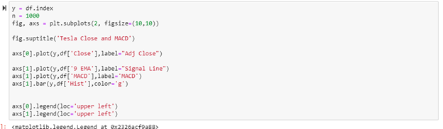
Below shows the code used to create the chart. The charts were stacked with the closing values chart on top of the MACD chart. This was done to see how to price fluctuates with the MACD.
The final output graphs can be seen below.