Introduction
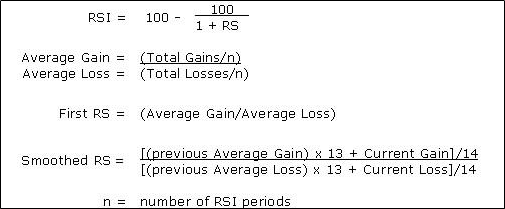
The purpose of this project was to create a graph of the relative strength index (RSI) for a stock using the formula below. The RSI is a momentum indicator that indicates whether a stock is overbought or oversold. Traditionally, the stock is overbought when the RSI is above 70 and is over sold when the RSI is below 30. Typically the standard number of RSI periods (n in formula below) is 14 days.
To begin I imported all of the standard libraries I used for all of my stock projects seen below.
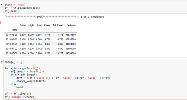
The stock I chose to analyze was Tesla. I began by importing this dataset and looking at the head of it. To begin the RSI calculation, the percent change for each day needed to be calculated. The code below the dataset shows how I created a list of the percent change for each day of the stock.
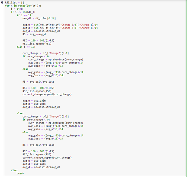
Once the percent change for each day of the stock was calculated, made a list, and added to the data frame, I began calculating the RSI using the for loop shown below. To begin the calculation, the RSI for the first 14 days was found in the first if statement in the for loop. This was separated out because the first RSI calculation does not use the smoothing factor, but the RSI calculations afterwards use the smoothing factor. Since the formula for calculating the smoothed RSI uses the previous average gain and average loss, avg_ u and avg_d (seen in code below) were strategically set to equal avg_gain and avg_loss at the end of the elif/else statements to carry over the previous value when iterated over again. Python has built in functions to calculate rolling means such as the rolling function that will be shown in the MACD calculation. For this program in regards to RSI, I wanted to create a function that calculated everything from scratch.
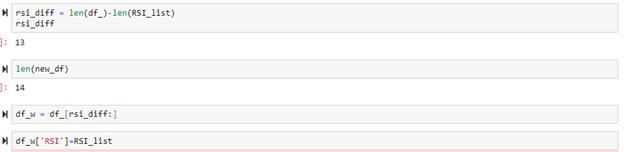
After the RSI_list was created, I adjusted the dataframe accordingly so that the list could be added onto the dataframe. Since the first 14 percent changes were used to calculate the first iteration of RSI, there were no corresponding RSIs for the first 14 rows and the dataframe needed to take this into account so the length of the dataframe and length of the RSI list matched.
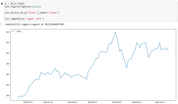
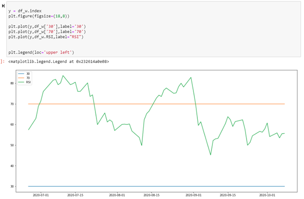
Since I imported the entire stock dataset, I sliced from row 2500 down so that the chart would show from just 7/1/2020 to 10/1/2020. This also showed the RSI chart in a more zoomed in graph that is easier to read. As mentioned previously, RSI with a value of 70 and 30 are the standard values to exam for overbought and over sold conditions and that is why they are included on the graph.

This graph shows the close price of the stock on the same timeline as the previous graph. A combination of these two graphs can be used to make investing decisions.